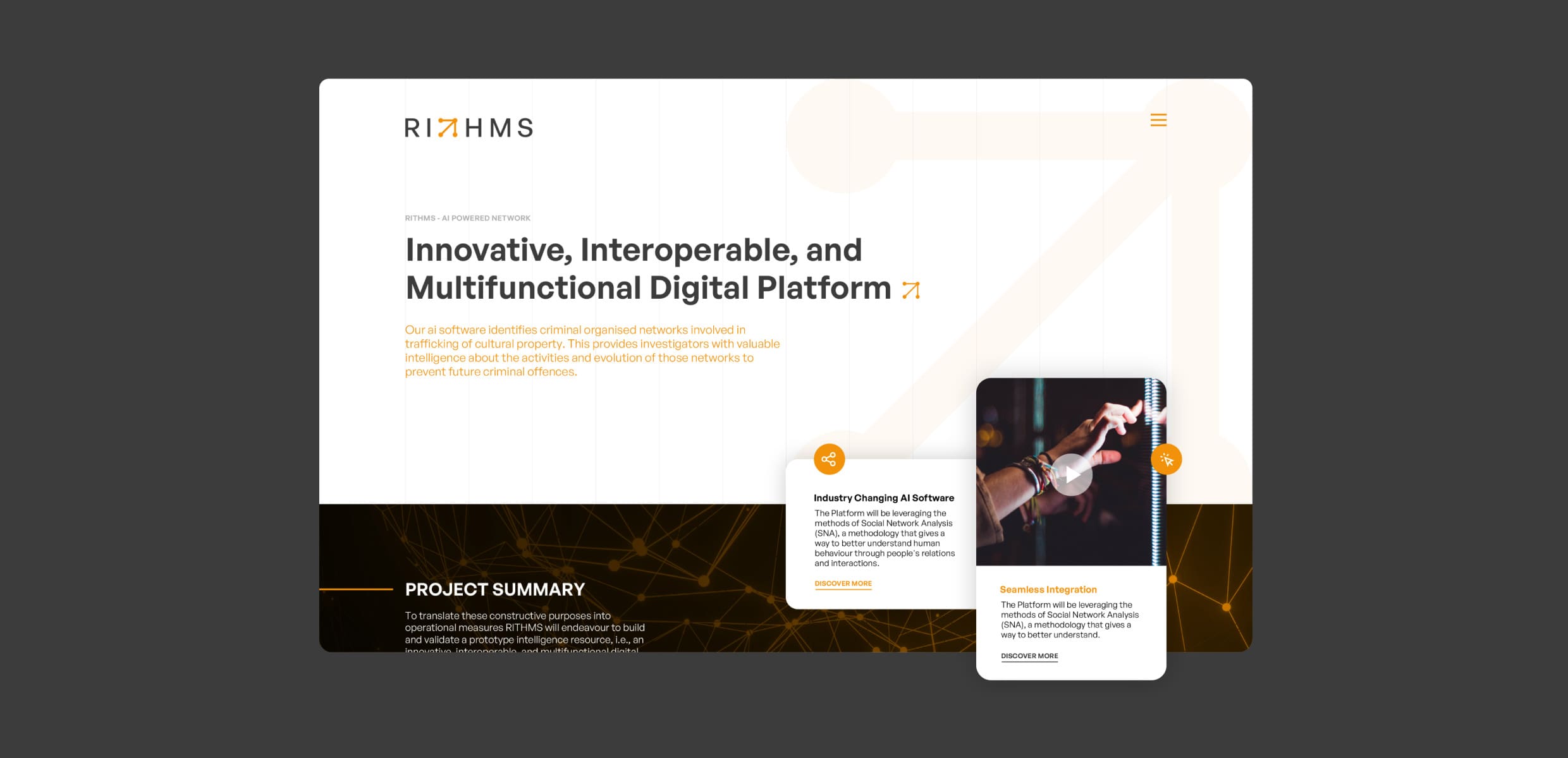
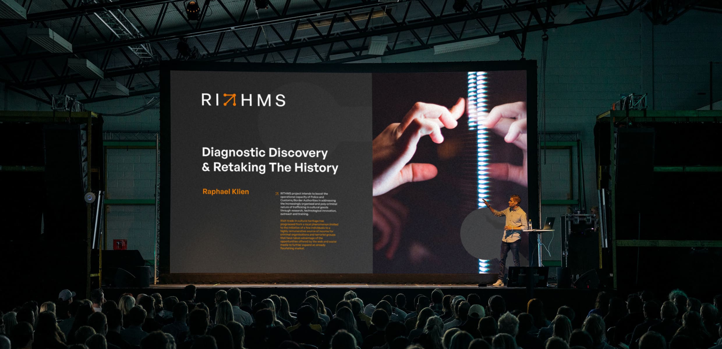
RITHMS aims to support the Police and Customs Authorities in addressing the poly-criminal nature of goods trafficking through research, technological innovation, outreach and training.
RITHMS’ target audience: international government agencies. No pressure. We needed to create a visual identity that felt appropriate for officials and also conveyed a sense of connection to reflect the interdepartmental work that RITHMS does.
With the EU project in its infancy, it was important to focus on something clear, bold and easily recognisable as part of this multinational project.
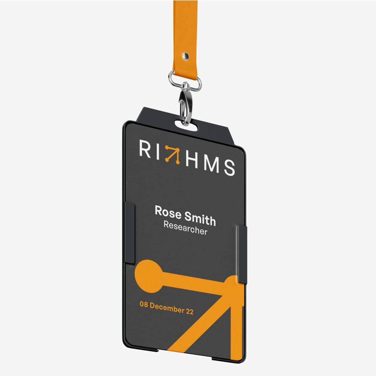
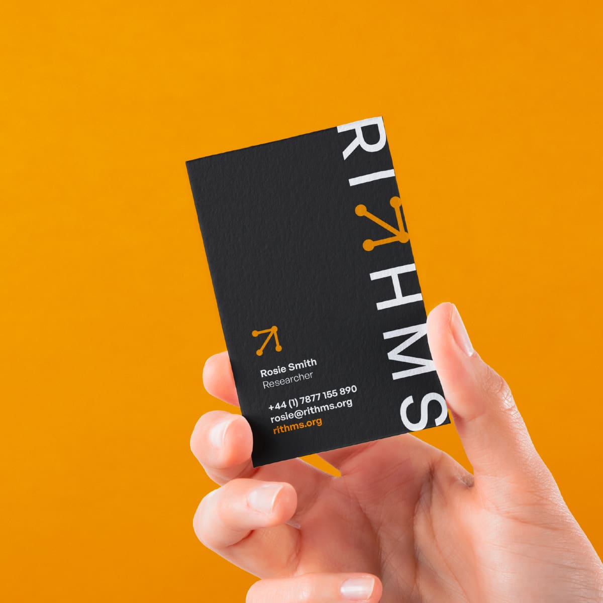
We began by exploring the idea of networks and the connection between organisations. The ‘connected arrow’ brand mark was initially inspired by the string and pins of an investigation board, which we updated for a modern channel to reflect RITHMS’ work to use collaboration to stop criminal networks. This developed into a mark that shows the connections between elements, information or locations.
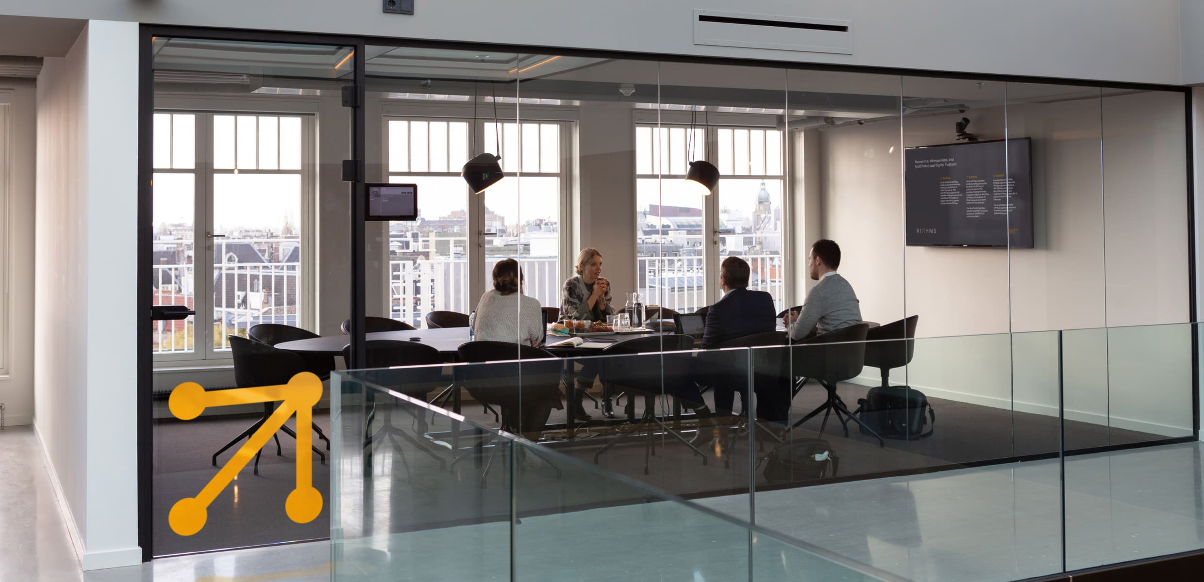
The colour scheme is consciously high impact and contributes to a sense of ‘alertness’. The brand mark is clean and simple and its versatility is demonstrated in its uses as a wayfinding arrow, call to action and content frame.
#3C3C3B
#F5F5F5
#F39200
#FAFAFA
Team
Brand Design. Adam Jennings Digital Design. Will Noble
Client Comments
We needed an experienced studio that understands brands well and can apply theoretical knowledge according to the business needs. The team had strong communication at every stage. Now I have worked with Countour for more than five years. They always deliver exceptional work that is fascinating. Their critical contribution helped to make every project a success. You need Contour on your team!
Petar Chardakov – Projects Director, EEMA
Over the years, we have relied on Contour to shape our image and communications to the market. Our focus has always been on achieving business objectives and creating something that is exciting and empowering. Contour’s genius is to translate the essence of our ambitions for our individual programs and establish a graphics toolbox and pallet across all the media channels that reflects and enhances our messaging and substantially contributes to our communications.
This website uses cookies to improve your experience while you navigate through the website. Out of these, the cookies that are categorized as necessary are stored on your browser as they are essential for the working of basic functionalities of the website. We also use third-party cookies that help us analyze and understand how you use this website. These cookies will be stored in your browser only with your consent. You also have the option to opt-out of these cookies. But opting out of some of these cookies may affect your browsing experience.
Necessary cookies are absolutely essential for the website to function properly. These cookies ensure basic functionalities and security features of the website, anonymously.
Cookie
Duration
Description
cookielawinfo-checkbox-analytics
11 months
This cookie is set by GDPR Cookie Consent plugin. The cookie is used to store the user consent for the cookies in the category "Analytics".
cookielawinfo-checkbox-functional
11 months
The cookie is set by GDPR cookie consent to record the user consent for the cookies in the category "Functional".
cookielawinfo-checkbox-necessary
11 months
This cookie is set by GDPR Cookie Consent plugin. The cookies is used to store the user consent for the cookies in the category "Necessary".
cookielawinfo-checkbox-others
11 months
This cookie is set by GDPR Cookie Consent plugin. The cookie is used to store the user consent for the cookies in the category "Other.
cookielawinfo-checkbox-performance
11 months
This cookie is set by GDPR Cookie Consent plugin. The cookie is used to store the user consent for the cookies in the category "Performance".
viewed_cookie_policy
11 months
The cookie is set by the GDPR Cookie Consent plugin and is used to store whether or not user has consented to the use of cookies. It does not store any personal data.
Functional cookies help to perform certain functionalities like sharing the content of the website on social media platforms, collect feedbacks, and other third-party features.
Performance cookies are used to understand and analyze the key performance indexes of the website which helps in delivering a better user experience for the visitors.
Analytical cookies are used to understand how visitors interact with the website. These cookies help provide information on metrics the number of visitors, bounce rate, traffic source, etc.
Advertisement cookies are used to provide visitors with relevant ads and marketing campaigns. These cookies track visitors across websites and collect information to provide customized ads.